Recently, Justin Hart, a data expert, tweeted a simple graph that puts the reported numbers of new COVID-19 cases into context. You can follow him at @justin_hart on your tweeter account. You will be able to read through all his work on analyzing the raw numbers about this particular virus.
With just aggregate numbers being reported by the media, having your own data expert to parse the information, makes you a contextually informed individual.
In his latest tweet, Mr. Hart showed a chart using the June cases in Florida. He discussed his new findings and how he got there in his latest interview with Daniel Horowitz on Mr. Horowitz’s podcast.

Context or Truth is always good. What we do with it, or how it makes us feel, is up to us. But, it’s good to juxtapose it with our own biases. Here’s another helpful article from Justin Hart that he wrote on March 18 of this year, just when this particular coronavirus was starting to engulf the world. Mr. Hart dove into the numbers to explain to us what was ahead of us then. His article also showed past panic driven narratives that we’ve been exposed to.
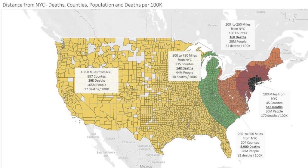
The image below shows deaths per 100K population. The US is a BIG country and you can see the virus has had a heterogenous effect. Ask yourself why we have a homogenous approach to it.
(Featured Photo From CBS Philadelphia)

If younrecall there is also a technical paper published in the CDC website about a month ago. In it, they show their best current estimates of fatality (mortality) rates stratified by age group.The fatality rates are low, consistent with the findings of the data experts you mentioned.
LikeLike
Yes, I do recall. Go ahead and post it here with your explanation on the data. Or send me post and we’ll make sure that it shows your authorship. It was very informative.
LikeLike